Designing custom apparel can be a fun and rewarding process. Whether you need new designs for an event or merch for your audience, the same principles apply. However, as fun as custom designs can be, there are a few common mistakes that people make along the way. Knowing what these mistakes are is key to avoiding them and ensuring that your designs shine like they’re meant to.
So what are some of the biggest mistakes to avoid when designing custom apparel?
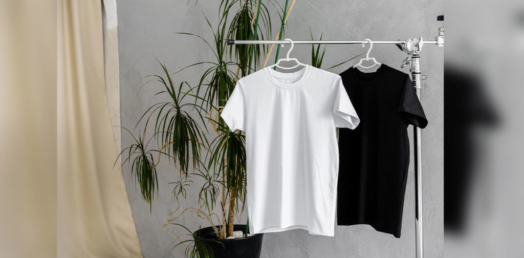
Design placement
It can be easy to think of a design before you think of how it will look on the medium (clothing, in this case). A full-size print may work on a t-shirt, but shorts or a hoodie with a zipper would add some complications. The best designers take time to understand the placement and composition of their designs and build around that.
It also helps to think of which items are usually paired with the apparel you’re making. T-shirts for a winter or fall range might benefit from more central placement if they’re going to be paired with a light jacket or shirt. On the other hand, tees for the summer are likely to be worn as a single layer, so you have more room to play around with placement.
Too many colors
We’ve written about the importance of choosing the right color for your designs before, but it’s always worth a reminder. Color theory isn’t just about which colors complement each other – it’s also about the subtext and story baked into every shade.
Warm tones like yellow, orange, and red have a distinctly different feeling to cooler tones like blue, green, and purple. Color temperature isn’t even necessarily about which “color group” you choose. Color temperature is a range. Usually, “warmth” is about the intensity of a red tint, and coolness is about the intensity of a blue tint.
Understanding how intensity affects color will help you create a more balanced palette and avoid garish combinations that don’t quite work. Pro tip: don’t be afraid to look at the same design on different screens; there can be some variation in the color you’re seeing.
Design complexity
You may have seen a certain design trend going around in the last thirty years. Some of the biggest and most recognizable brands in the world are simplifying their logos. Everyone from digital giants like Slack and Apple to household apparel names like Nike has redesigned their logos to be simpler. Pepsi, Uber, Instagram, YouTube – the names are diverse, but the reasons are pretty common.
Highly detailed logos may look great on a screen where they’re just pixels, but they’re expensive to reproduce in print. Where a digital image can be shared infinitely online, complex apparel designs use more resources. Textured designs also add to the complexity and often need special machinery or textiles to be produced.
Simpler designs give you more options and they cost in the long run – two factors that are always worth keeping in mind.
Font colors and sizes
As tempting as it is to print an entire novel on the front of a shirt, there’s a reason it’s not a viable mainstream design. Other than the obvious copyright liabilities, no one would be able to read it! That’s the trouble with a font that’s too small or text with too many words. Ideally, when working with fonts on apparel, you want to design something that can be read at a glance by a stranger walking past.
Anything that takes more than 2-3 seconds to decipher is less likely to convey its meaning every time.
Similarly, big bold text can come across as obnoxious if you use a difficult to read font or if the font color clashes with the apparel’s base color. That’s why white is such a popular color for bold font designs, especially on brightly-colored shirts.
Remember to pay close attention to the placement of your font too, especially if you don’t plan on having it central. Off-center fonts tend to be logos, and they’re usually pushed to the left (i.e. the side you would usually find a breast pocket on a polo shirt). Even if your design keeps the font central, consider how high or low down the centerline the wording is going to sit.
The chest is still the most effective placement, and we can define it as anywhere between your diaphragm and collarbone. Chest placement also keeps the design at a height where the looker’s eyes are encouraged to go back up to the face. After all, no one wants to have a conversation with someone constantly staring at their naval.
Moving the eye
Speaking of lookers, many designs fail by not taking their audience into account. We know that our designs should attract the people we want to buy them, but once a buyer puts the shirt on, they’re no longer the audience – whoever they’re facing is. A good design takes advantage of that by considering how an audience member’s “eye” moves across it.
Where is the initial focus on the design? Where is the eye encouraged to move next and is there a clear structure to follow? We often think of a “busy” design as having too much going on. While that’s true, “too busy” can also mean a lack of structure or focus.
Licensing
This is one of the most important mistakes to avoid because it can have legal ramifications. When creating a design or working with a designer, always make sure that you have the rights to any design element that will end up on the apparel.
Of course, anything you design yourself is yours by copyright law, but consider the fonts you download, images you incorporate and even the brush packs you use on Photoshop. It can be easy to get lost in an inspired design session, but it’s important to go about it the right way too.
If you’re using images of people – even stock photo models – check the licensing terms when you accept them. Some photographers and models don’t want their likeness or content associated with certain messages, and they’ll usually outline those clauses in the terms.
If you can keep these quick tips in mind, you’ll be well on your way to creating an eye-catching, memorable design!

